Web design trends 2013
New website technologies coming to the fore
The web is still a relatively new communications medium, first becoming a commercial platform in the mid nineties. Since then, the web or more formally ‘Internet’, has evolved rapidly to become a key feature, with research suggesting that many of us spend several hours per day on-line. The pace of Internet development is fast with new web authoring tools and technologies appearing all of the time.
At Dental Media we are always looking for new ways to improve our clients’ websites to help them differentiate from the competition – here are a few recent website developments which we expect to become standard features as 2013 progresses:
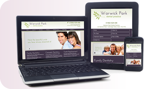
Responsive design
This technique allows a website to display optimally on all devices, whether a desk-top, tablet or mobile ‘phone. We’ve been producing ‘responsive’ websites for our clients for the last 8 months and the technique is covered in more detail here. We expect the majority of our new dental websites to be built responsively, virtually eliminating the need for a separate mobile site.
Microformats – structured data
 Microformats are html (web code) extensions that are used to ‘mark up’ specific sections of a web page e.g. a product, person, event, reviews etc, with additional information. This information is picked-up and used by search engines and browsers and can provide advantages with click through rates as well as providing a more useful user experience. We expect this type of formatting to become commonplace as the advantages become clearer to website owners.
Faster, performance optimised websites
We’ve all seen the grossly over-designed websites that are entirely ‘form over function’. Lots of huge background images and bloated javascript libraries for image changers. Such websites perform brilliantly on our 50 meg high speed broadband connections in the office. However, when viewed on mobile, even on ‘fast’ 3G connections, these sites fail miserably and frustrate the user.
In 2012, the average web page size approached 1 megabyte as site owners pressed for fancy features and designers ‘forgot’ about usability. However, as 2013 progresses and there is a renewed focus on usability and mobile performance, bloated design will become a thing of the past. It’s also very important to remember that page loading speed is now an important factor in the way Google ranks websites – basically fast websites are preferred by Google and are ranked accordingly. So moving forward, it’s all about form and function.
Support for high resolution retina displays
With the advent of ultra high definition displays, it is becoming important to identify the device on which a website is being viewed and then serve a correctly optimised set of images accordingly. This technique is still very new and as yet there is no “de facto” standard for doing it robustly. However, we are testing various methods to determine the best option for use on client websites.
Detailed illustrations and animations
A great way of making a website stand out from the crowd is by using illustrations and animations as an alternative to the “samey” stock images that abound. Expect to see more of this in the coming months.
Yet more video
Video on dental websites has been a ‘game changer’ for the last couple of years, both in terms of user engagement and the benefits for SEO. Click the image to play:
With the price of producing great quality web video falling significantly, the technique is now becoming much more accessible. With a day’s filming and production available for less than £1.5k, we are seeing a significant increase in video enquiries as more clients tap into this excellent resource.
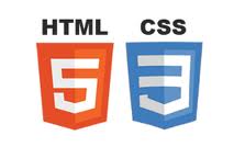
HTML5 and CSS3 – latest coding standards
The underlying code that powers websites changes over time to incorporate new components and features for display in modern browsers, for example the production of interesting visual effects without using lots of images. Some of these elements are particularly useful and the Dental Media design team are already building them into new designs.
 However, like anything new, care must be taken to ensure that these effects can be replicated robustly across all of the main browsers that are in use today (including mobile devices).
Unfortunately, not all browsers are the same in that they all have different levels of web standards support; consequently great care and comprehensive testing is needed when rolling out new features. Despite these complications, we expect new and novel web design features to appear at pace as 2013 progresses.
Summary
At Dental Media we are focused on identifying and testing the latest web technologies for use in our clients’ websites. If you would like to know more, please call us on 01332 672548 for a no-obligation discussion to see how we can assist.